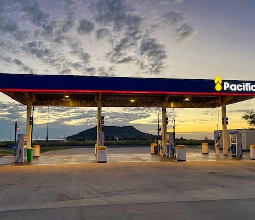
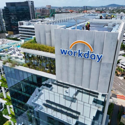
Grace Group has recently rolled out a rebrand of all its business units across 40 sites. The brand refresh – the first since 1983 – was to make the brand more contemporary and simpler. The new look retains Grace’s iconic red with the new tag line ‘always more’.
Grace’s decision to partner with Albert Smith Signs (ASS) was taken after an exhaustive tender process.
ASS was contracted to:
- Enhance the new style guide referencing signage font size constraints within various sign proportions.
- Undertake nation-wide business signage site surveys
- Complete and submit corporate signage rebrand before/after montage artwork
- Complete council and building permit approvals
- Workshop drawings, engineer’s certs and manufacture signage to specifications
- Manage logistics nationally
- Address all site specific installation requirements
- Provide transparent customer service to client project management
- Compile completion photos and site by site project sign off
- Manage all site specific communications, submissions, approvals, completion documentation etc. via our web based Smart Advantage system.
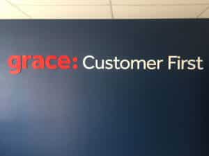
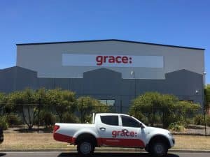
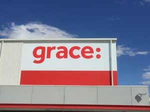
The suite of rebranding products consisted of external building signs, internal building signs and directional signage – with each site dealt with in a bespoke manner with the corporate signage tailored to suit.
The building signage was 3D or 2D white Aluminium Composite Material (ACM) with UV stabilised red lettering fixed to the varying building structures and surfaces.
The internal building sign brand identification was achieved with laser cut white acrylic letters and sprayed red, where required.
Brand value statements were reversed decorated clear acrylic.
“Thanks to all at Albert Smith who assisted with this project – from the site surveys, detailed montages, fully scoped and itemised quotations and prompt invoicing the process was seamless. Issues have been few and minor and addressed promptly” – Grace Project Manager
Considering a national brand rollout?
At Albert Smith Signs we have the experience and capabilities
